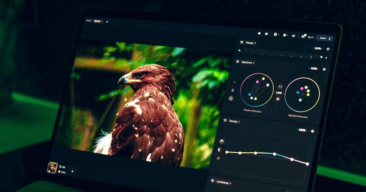
You spend an hour grading a set. The skin tones are warm, the greens are rich, the whole thing sings on your monitor. You export, upload, and open the gallery on your phone to check it, and the color has gone flat. The reds are muddy, the punch is gone. Your first instinct is that your screen is lying to you, or that the upload wrecked the files. Usually neither is true. What you are looking at is a color space mismatch, and it is the single most common technical reason a photo looks worse on the web than it did in your editor.
The good news is that this is a solved problem with a boring, reliable fix. You just have to understand what is happening under the hood, because the tools will happily let you do the wrong thing by default.
The short answer, if you just need the fix
Your photos look washed out because the file was exported in a wide color space (Adobe RGB or ProPhoto RGB) or with no color profile attached, and the browser or phone showing it assumed sRGB instead. The saturated colors get read with the wrong dictionary, so they come out flat.
The fix is two export settings, and you need both: convert to sRGB, and embed the ICC profile. Do that and the same file will look the way you graded it on almost any screen.
The rest of this post explains why that works, which matters the first time an export looks wrong anyway.
What a color space actually is
A color space is the dictionary a file uses to turn numbers into colors. The same pixel value, say red at 220, means a different actual red depending on which dictionary you read it with. That is the entire problem in one sentence.
Three dictionaries matter to you:
- sRGB is the small, safe one. It is the assumed default of the web, most phones, and anything that does not say otherwise. Its gamut, the range of colors it can describe, is the narrowest of the three.
- Adobe RGB is wider, especially in the greens and cyans. Useful for print workflows where the paper can actually reproduce those colors.
- ProPhoto RGB is enormous, wider than any screen can show. Lightroom edits internally in a space this big so you have room to push files around without clipping.
Wider sounds better, and for editing it is. For delivery it is a trap.
The exact moment it goes wrong
Here is the failure, step by step. You edit in a wide gamut. You export as Adobe RGB or ProPhoto, or you export without embedding a color profile at all. The file now contains numbers that only make sense in a wide dictionary. Then it lands in a viewer that is not color managed, which historically meant a lot of browsers, older phones, and most social apps. That viewer does not read the profile. It assumes sRGB and interprets your wide-gamut numbers with the small dictionary.

A saturated wide-gamut red, read as if it were sRGB, comes out looking desaturated and dull. Multiply that across every color in the frame and you get the washed-out look. The pixels are fine. The label got lost or ignored.
This is why the same file can look perfect in Photoshop, which is color managed and reads the profile correctly, and flat in a preview pane that is not.
The rule: convert to sRGB and embed the profile
For anything destined for a screen, export in sRGB and embed the ICC profile. Those are two separate settings and you need both.
Converting to sRGB translates your colors into the small dictionary that viewers assume, so even a dumb viewer gets them right. Embedding the profile stamps the file with a note that says, explicitly, "read me as sRGB," so the smart viewers do not have to guess either. Skipping the embed to save a few kilobytes is a false economy that reintroduces the exact ambiguity you are trying to kill.
Keep your master files in the wide space for archiving and print. Convert to sRGB only on the web export. Never edit in sRGB just to avoid this problem, because you throw away editing headroom for no reason.
The export settings that actually matter
When you set up a web export, these are the fields worth getting right:
- Color space: sRGB. Non-negotiable for web.
- Embed color profile: on. The other half of the fix.
- Bit depth: 8-bit. 16-bit is for editing, pointless and heavy for a JPEG.
- Resize: to a sensible long edge, often 2048 to 3000 px for a gallery. Nobody needs your full 45-megapixel file to look at a photo on a laptop.
- Quality: around 80. The difference between 80 and 100 is mostly file size, not visible quality, and file size is what makes a gallery feel slow.
- Output sharpening: for screen. Downscaling softens an image, so a touch of screen sharpening on export restores the crispness you see at full resolution.
Verify it instead of trusting it
Do not assume the export did what you asked. You can read the embedded profile straight off the file. With ImageMagick:
magick identify -verbose photo.jpg | grep -i "colorspace\|profile"Or with exiftool, which is cleaner for this:
exiftool -ColorSpace -ProfileDescription photo.jpg
# ColorSpace       : sRGB
# Profile Description : sRGB IEC61966-2.1
If that comes back as Adobe RGB, ProPhoto, or blank, your viewers are guessing and some of them are guessing wrong. Fix the export preset once and this class of bug disappears for good.
Calibration and soft proofing still count
Converting to sRGB fixes the mismatch, but it cannot fix a monitor that shows the wrong colors in the first place. If your screen is uncalibrated, you are grading against a lie, and sRGB will faithfully deliver that lie everywhere. Calibrate the display, and before a big delivery, use your editor's soft-proofing view set to sRGB to preview how the conversion will actually look. It takes seconds and it catches the occasional saturated color that clips noticeably on the way down.
Where delivery fits in
All of this care can still be undone at the last step. Some platforms re-compress what you upload, strip the ICC profile to shave bytes, or generate previews in the wrong space, quietly reintroducing the washed-out look you just spent an afternoon avoiding. When you deliver galleries, it is worth knowing that your files are served as you exported them: sRGB, profile intact, resized cleanly rather than crushed. A platform built for photographers treats the file you uploaded as the file the client should see, which is how Xposure delivers a gallery, which is the whole point of getting the export right.
Get the pipeline correct once, from a calibrated screen through an sRGB export with an embedded profile to a delivery that leaves your files alone, and the gap between what you see and what your client sees closes. The photo that sang on your monitor finally sings on their phone too.