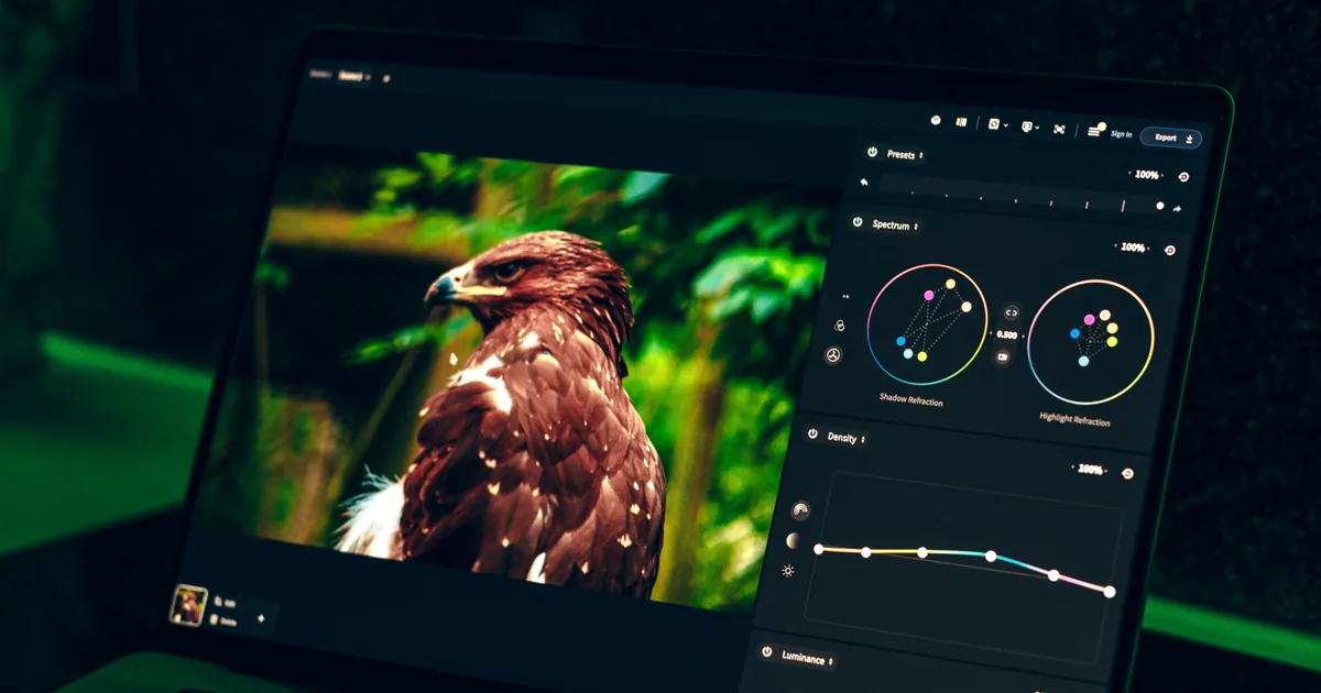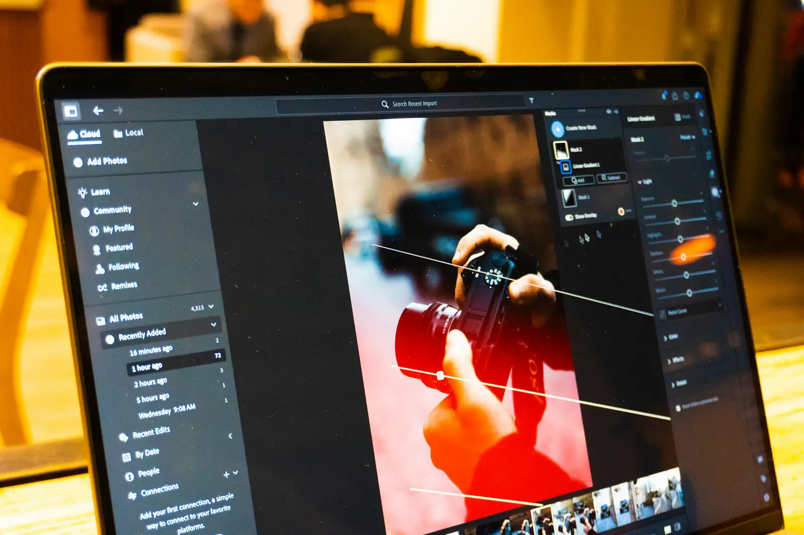
When people say a photographer has a style, they usually mean the photos look like they belong together. Skin tones fall the same way, the shadows have a consistent mood, greens are not lurid in one frame and muted in the next. That consistency is what makes a body of work feel intentional instead of accidental, and it is more learnable than it looks.
Style is not a filter. It is a small stack of decisions you make the same way every time. Here is how to build yours and, just as importantly, how to hold it across an entire delivery.
Nail white balance first, always
Every color decision downstream depends on a correct starting point, and the starting point is white balance. Get it wrong and you are grading on a crooked foundation, fighting a color cast in every single frame.
Set it deliberately rather than trusting auto, which drifts from shot to shot as the framing changes. If you can, include a grey card in one frame per lighting setup so you have a reference to sync the rest against. Correct neutral first, then style. Never the other way around.
Decide your relationship with three things
A signature look mostly comes down to how you handle three areas consistently. Pick a position on each and stick to it:
- Skin tones. Warm and golden, or clean and neutral? This is the most important decision you will make, because people notice skin before anything else. Choose one and protect it.
- Shadows. Deep and moody with crushed blacks, or soft and lifted and airy? This sets the emotional temperature of the image more than any other move.
- A signature color. Many recognizable styles quietly push one color a consistent direction, teal shadows, muted greens, warm highlights. One is plenty. Two is a lot. Three is a mess.
Write your choices down. A style you can describe in a sentence is a style you can repeat.
Build one base adjustment, then vary gently
Once you know your three positions, build a single base adjustment that gets you most of the way there, and apply it as your starting point on every image. Presets are useful here, but treat them as a starting line, not a finish line. No preset survives contact with real light unchanged.
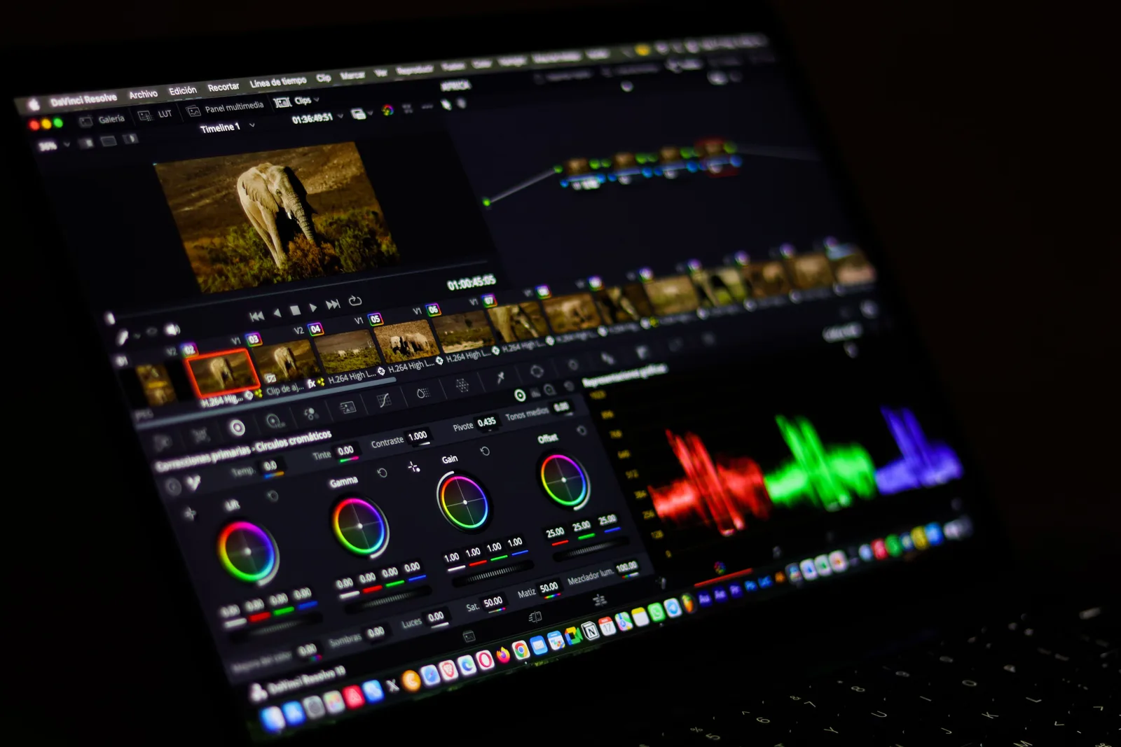
Consistency does not mean every photo is identical. It means every photo feels like it came from the same hand. The base gets you there; the small adjustments keep it honest.
From that base, adjust each image gently for its own exposure and light. The goal is a gallery that reads as one voice, not forty photos stamped from the same die.
Hold the look across the whole gallery
This is where most consistency falls apart. You grade the first ten images carefully, then fatigue sets in and the last thirty drift. The fix is process, not willpower.
Edit in batches by lighting condition rather than in shooting order. All the indoor frames together, all the golden-hour frames together. Similar light takes similar corrections, so you stay in one headspace instead of context-switching every frame. When you finish, view the gallery as a grid of thumbnails. Outliers that looked fine in isolation jump out immediately when they sit next to their neighbors.
Calibrate your screen or you are guessing
None of this matters if your monitor lies to you. An uncalibrated screen means your careful warm skin tones might be cold and green on the client's phone. You do not need expensive equipment, but you do need a screen you have calibrated and a habit of checking a few finished images on a second device before you deliver.
Let the look evolve, slowly
A signature style is not a cage. It should shift over the years as your taste matures. The difference between growth and inconsistency is time: evolving your look across seasons is style, changing it within a single gallery is noise. Keep it steady inside a delivery, and let it move between them.
Build the three decisions, build the base, edit in batches, and check your screen. Do that on every job and within a year of work, someone will look at a photo of yours with no name attached and know it is yours.