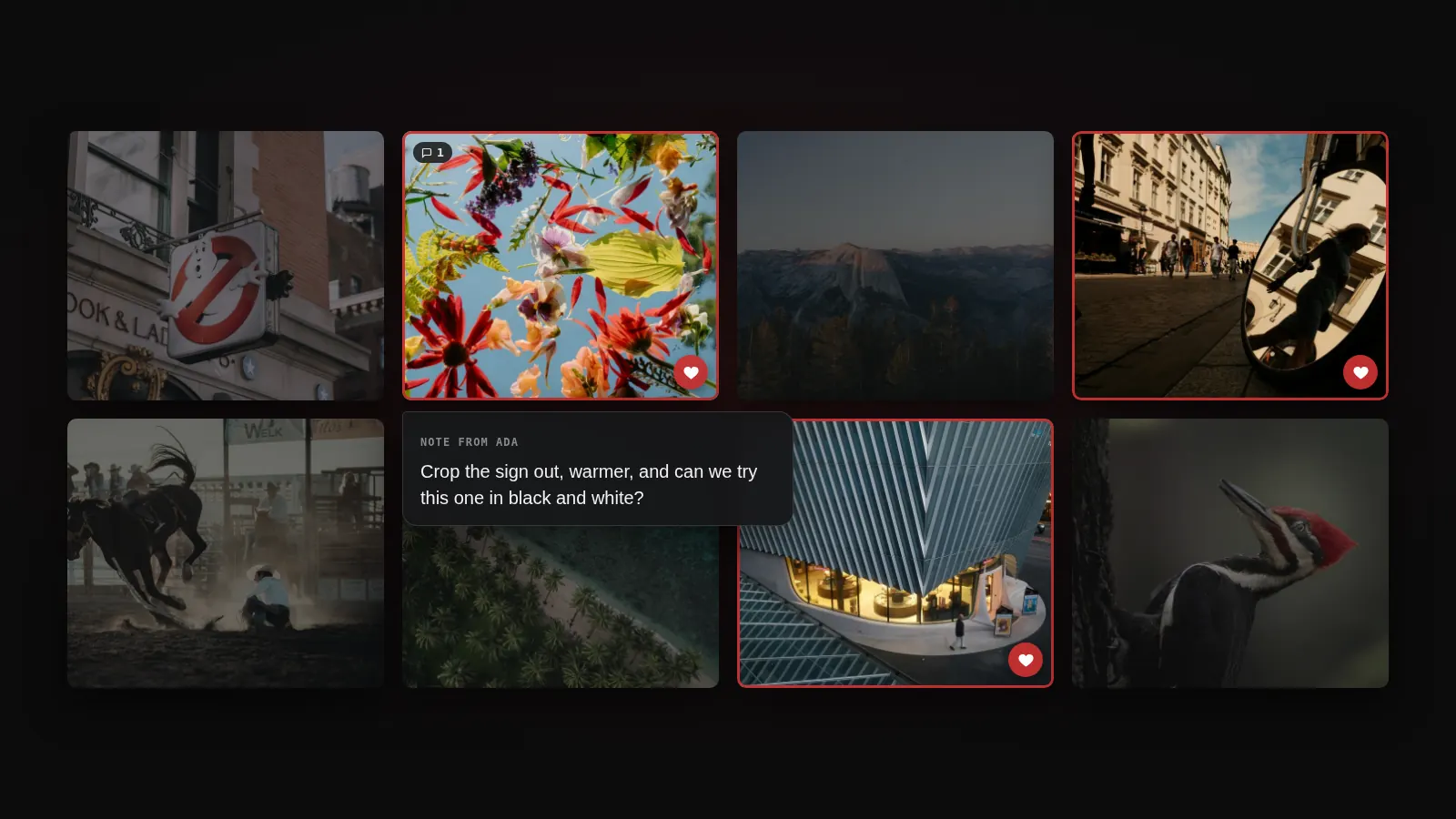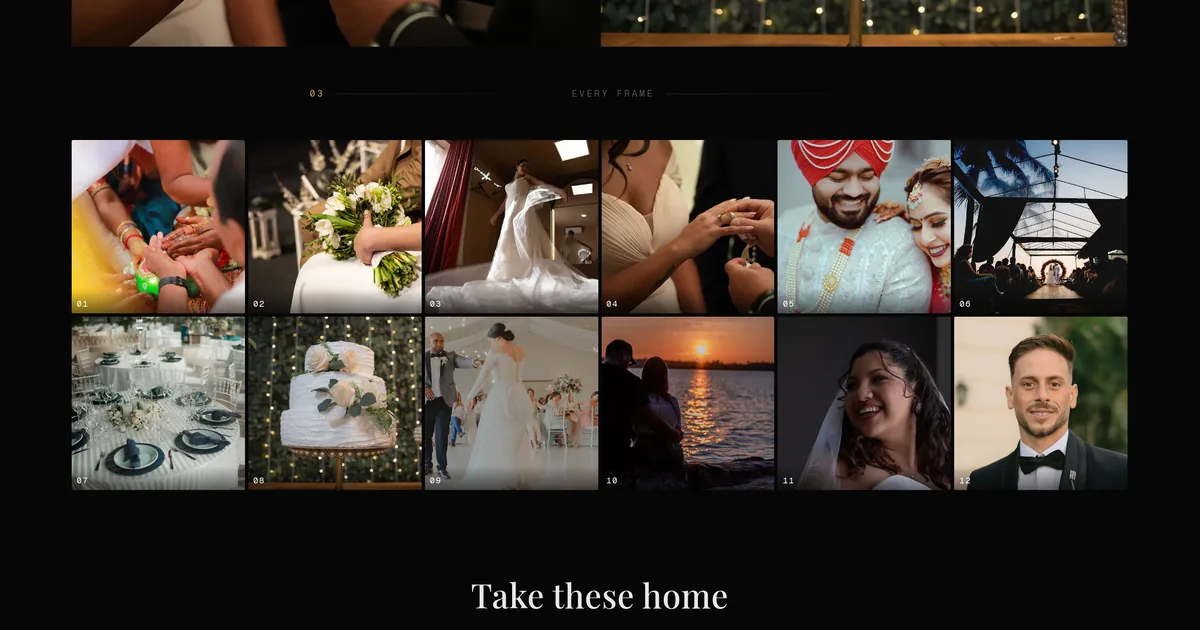
Most client galleries are a grid of photographs in the order the card reader produced them. That is fine for proofs and wrong for the work you would actually show someone. The set you would hand a client at a table has a beginning, a few deliberate pairings, one photograph you would print at a metre wide, and quite a lot you would flick past quickly.
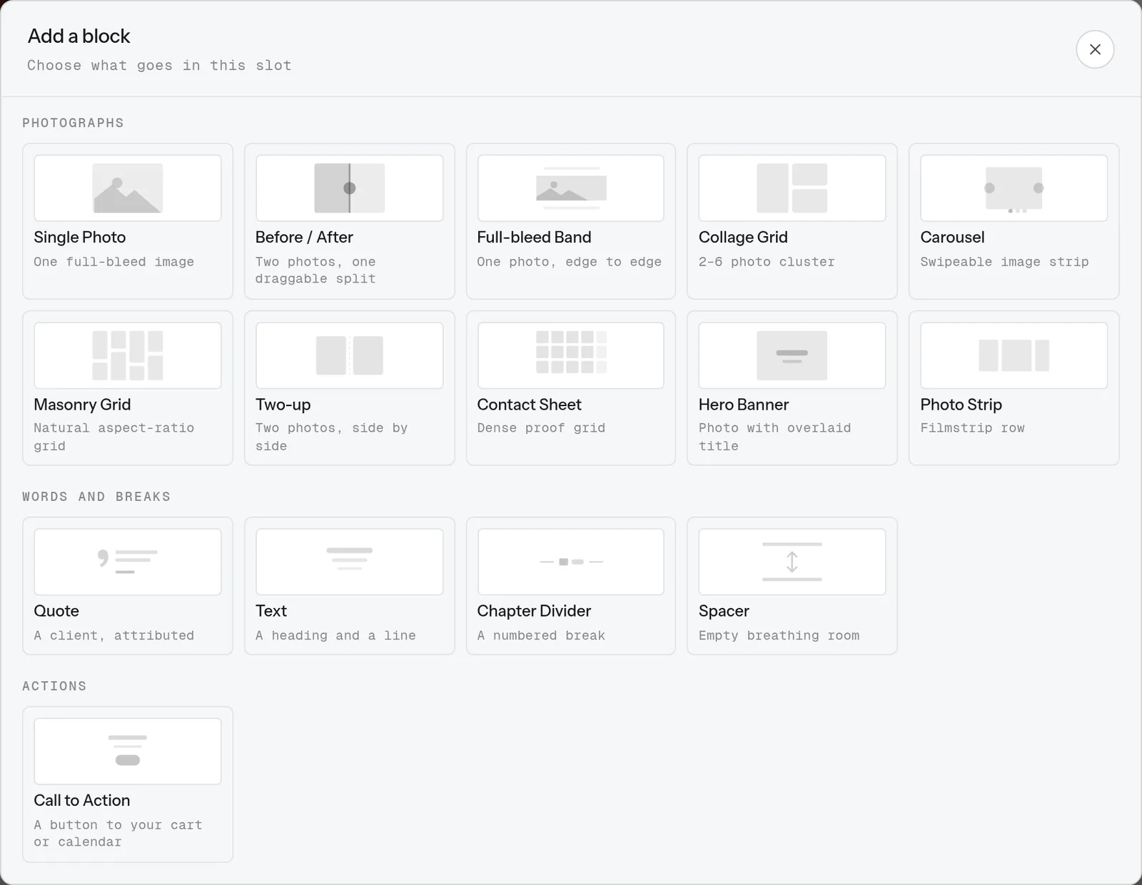
The gallery builder now has fifteen block types instead of eight. Seven of them are new, and they exist because none of the first eight could do these jobs.
Show the edit, not just the result
The before/after block is two photographs of one subject with a split you drag.
Almost nothing else in a photographer's toolkit shows the work rather than the outcome, and the work is what a lot of people are actually paying for. Retouching, restoration, a room staged before a viewing, a raw frame against the grade you spent an hour on. A client who sees the straight-out-of-camera version next to yours understands the invoice differently.
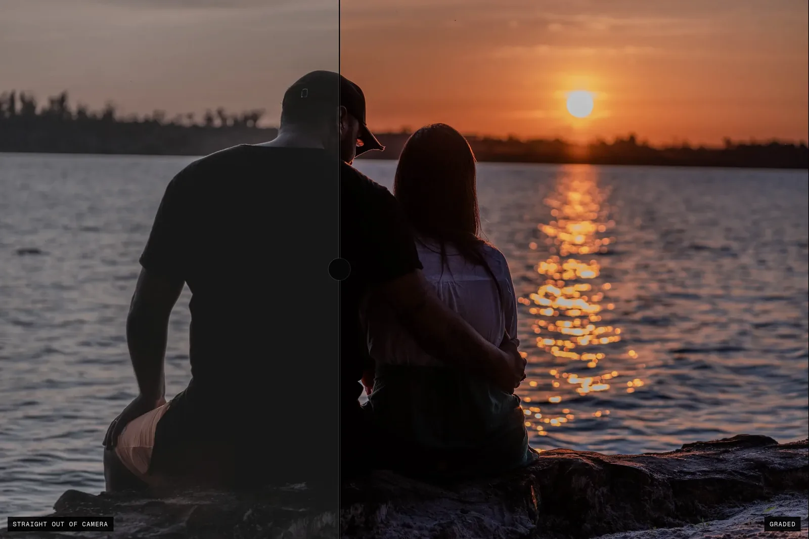
Your client can drag the handle, swipe it on a phone, or nudge it with the arrow keys. It is a standard browser slider underneath the styling, so all of that came for free rather than being bolted on, and it works with a screen reader too. You choose which photo is the "after", what the two labels say, and where the split sits when the page first loads.
Two photographs that belong together
The two-up block is a deliberate diptych with a gutter you choose, down to none at all.
A collage can already put two photos in a row, but it is a grid cell with a fixed gap, and the pairing is incidental. Here it is the point. The row is justified by aspect ratio, so a portrait beside a landscape renders at one height with both photographs at their true proportions, rather than two equal boxes with a hole under the shorter one. Each half takes its own caption.
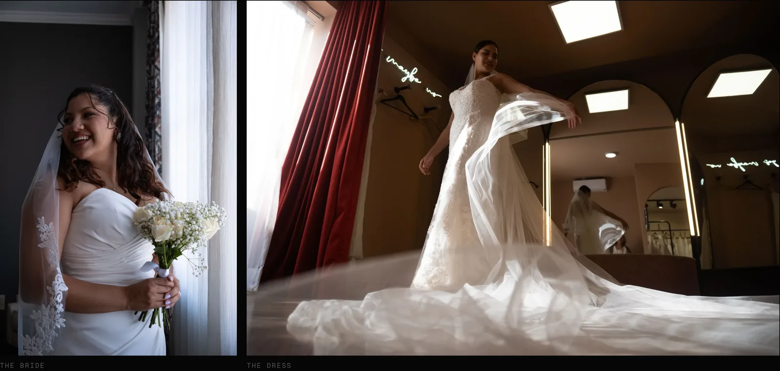
Everything, in order, for the people who want that
The contact sheet is the opposite of curation: a dense uniform grid, optionally numbered, that says "here is the lot".
It earns its place because it stays fast at any size. Every other photo block asks the CDN to resize your full resolution file for each tile. The contact sheet uses the 600px square thumbnail that already exists for every photo you have ever uploaded, which is why a 200 frame sheet loads like a small one.
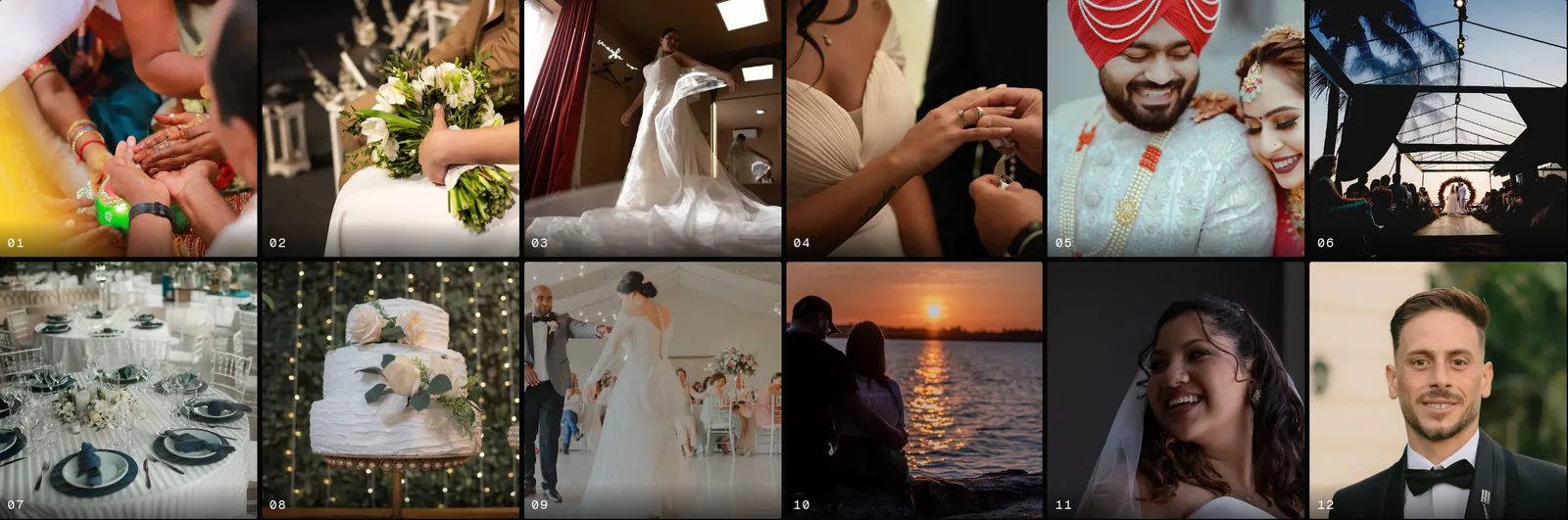
Turn the numbers on and your client stops describing photographs. "The one by the window where I am laughing" becomes "27". If you are still working out how much to hand over in the first place, we went through the realistic ranges in how many photos to deliver per session and built a calculator for it.
Words, breaks and one button
Three of the seven are not photographs at all.
- Quote. The client's own words with their name under them, set as a pull quote. A text block could always hold the sentence. What it could not hold was who said it, and an unattributed testimonial is just a sentence.
- Chapter divider. A numbered break you place anywhere, which also adds itself to the gallery's chapter navigation. Previously the only way to make a chapter was to name a whole section, which put the break at the top of that section and nowhere else.
- Call to action. One button pointing at your print store, your booking page, your contact form, or any link. If the target is not set up on that album, the block renders nothing rather than showing your client a button that goes nowhere.

The seventh is the full-bleed band: one photograph that breaks out of the content column and runs edge to edge. A hero banner could already do that, but it forces a title over the image. Sometimes the photograph should just be large and silent.
The builder itself got the boring fixes
New blocks are not much use in a tool that loses your work, so most of this release went somewhere less photogenic.
- Undo and redo, on Cmd+Z and Cmd+Shift+Z. Drag and drop without undo is a tool that can destroy twenty minutes in one gesture.
- Drag and drop for sections, for blocks between slots, and for photos inside a block.
- Half-built layouts save. An unfilled slot is stored as a gap instead of refusing the whole save, so an interrupted afternoon is no longer a lost one.
- The canvas renders the real gallery. Not an approximation of it. The builder and the public page are the same components now, so they cannot disagree with each other.
- Phone and tablet preview, at real device widths, inside the dashboard.
- Layout templates. Save a gallery's shape without its photos and apply it to the next album. Most wedding photographers are rebuilding the same rhythm every week.
- A layout health panel that counts what you cannot see by scrolling: photos still unplaced, a photo used twice forty sections apart, empty slots, and a rough page weight.
- Alt text per photo, which matters on a public portfolio album, where image search and screen readers otherwise get the same sentence repeated on every frame.
- A photo picker built for a wedding, with sort, filters, range select, and a filter for the photos your clients already picked in proofing.
Where to find it
Open an album, go to Appearance, set Layout to Advanced, and choose Open Gallery Builder. Existing galleries are untouched until you switch them over, so nothing changes for the clients looking at your work right now.
Press P on the canvas to see it as a client will, without the editing chrome. If you have never built a layout before, the Start a layout button shuffles your photos into one you can then take apart, which is a faster start than an empty page.
If you have been delivering a single long grid because building anything else took too long, this is the release that was meant to fix that. We wrote about what photographers actually use to deliver photos if you are still weighing up where your galleries should live.