Every family photographer gets the same message about a week before the session: "What should we wear?" It is worth answering properly, because clothing does more damage to a family portrait than any other variable you can control. A great location cannot rescue five people in clashing logos.
Here is the guide, written so you can send it to clients directly, or read it as the client who asked.
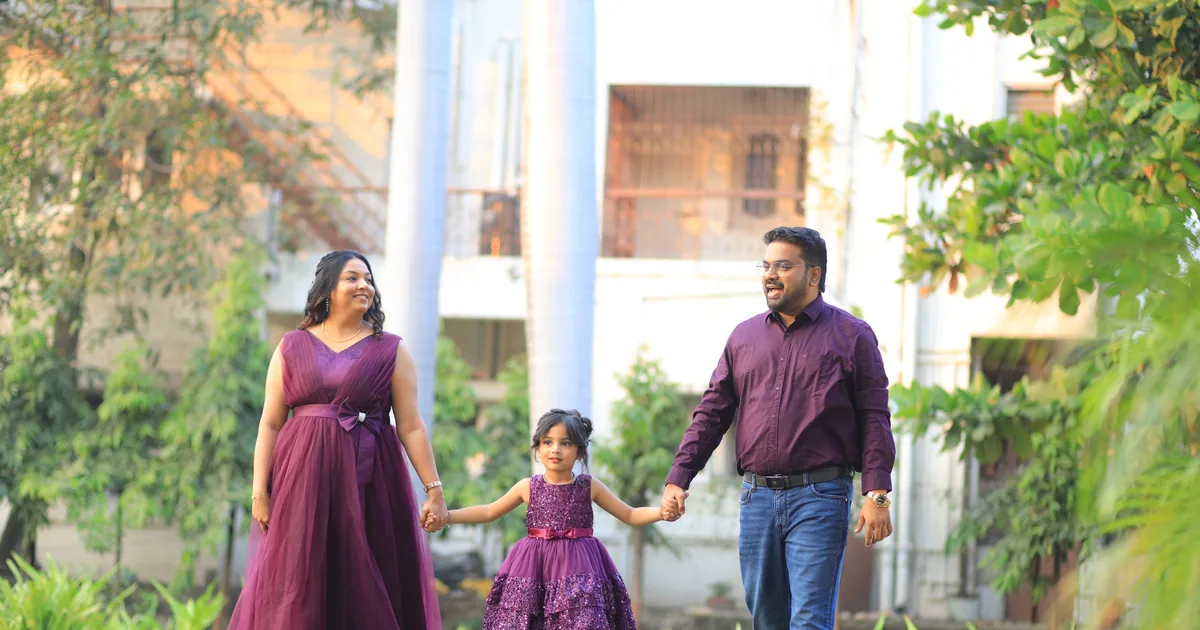
Pick two or three colours and spread them across the family
Not matching. Coordinating. Matching outfits, five people in white shirts and jeans, looks like a 2004 catalogue and makes everyone blend into one shape.
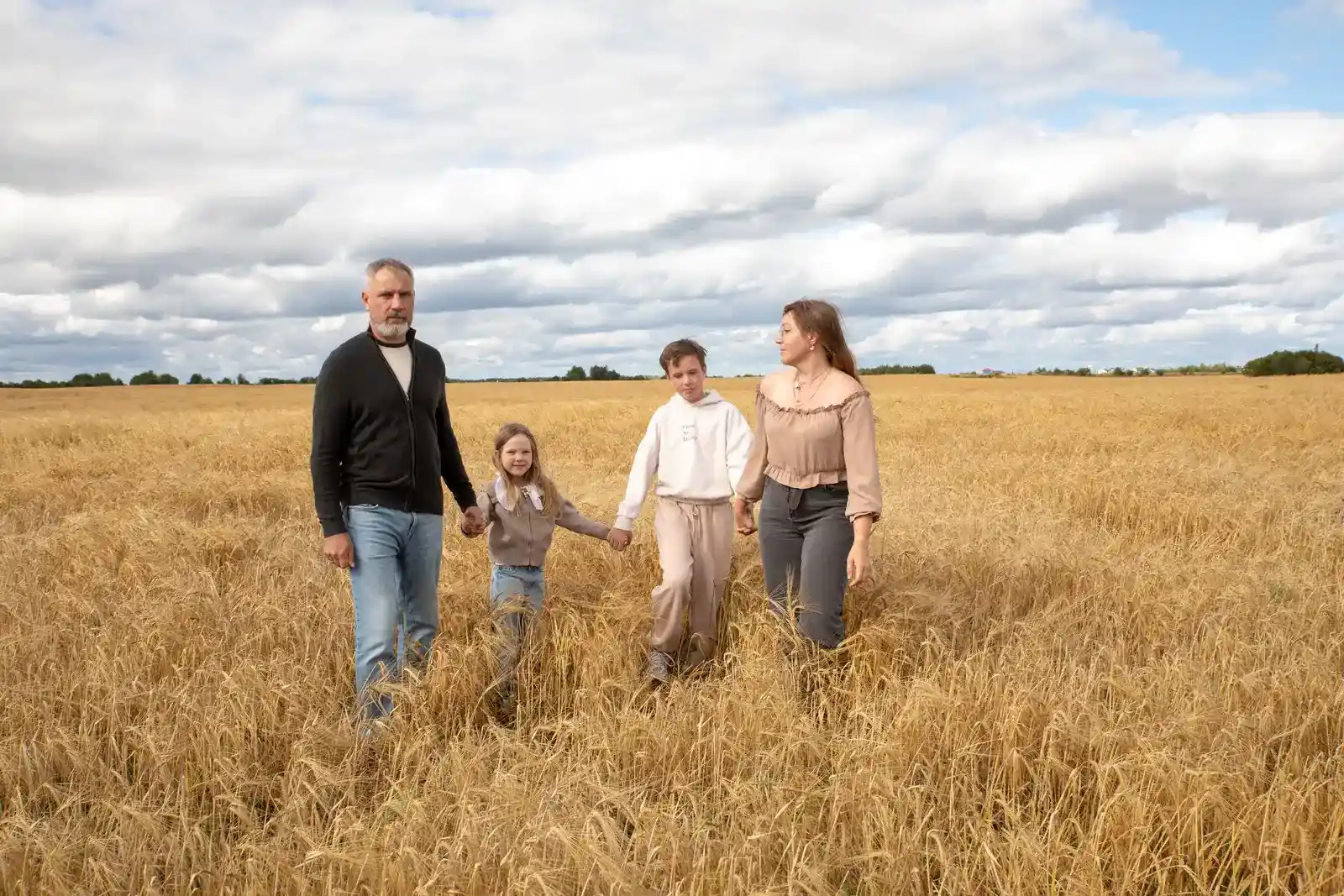
Choose a small palette, two or three colours plus a neutral, and distribute them. One person in the dusty blue, one in cream, one in a soft rust, one in a pattern that contains all three. The pattern person ties the group together, which is why you want exactly one of them.
Easiest way to build it: start with one person's favourite outfit and pick everyone else around it. Starting from a colour chart produces outfits nobody feels good in, and how someone feels in their clothes shows on their face.
Choose colours that suit where you are shooting
The location is the background, so the palette is really a background question.
- Woodland and parks: cream, rust, mustard, olive, warm neutrals. Avoid bright green, which fights the foliage.
- Beach and dunes: white, sand, pale blue, soft pink. Light and airy suits the environment.
- Urban and architectural: deeper, richer tones work here, navy, charcoal, burgundy, because concrete and brick can take the weight.
- At home: whatever suits the room, and generally softer than you would choose outdoors.
Also worth checking: what is on the wall where the print will hang. A family in autumn rust looks odd above a cool grey sofa, and this is exactly the sort of thing that comes up when you ask a client what the photos are actually for.
What photographs badly, specifically
- Logos and slogans. They pull the eye and date the photo instantly.
- Neon and hi-vis colours. They reflect onto skin. A neon green top gives a child a green chin, and it is genuinely difficult to fix in editing.
- Tight small patterns. Fine checks and thin stripes can shimmer strangely at certain distances.
- All black or all white on everyone. Either the group merges into a single block or the exposure has to compromise between the two.
- New shoes nobody has worn. They photograph stiff, and the child wearing them will be miserable within ten minutes.
Sunglasses on heads, phones in pockets that bulge, and lanyards left on are the three small things that appear in almost every raw take.
Texture and layers do more than colour
The photos people love have depth in them, and texture is where it comes from. Knits, linen, corduroy, denim, a scarf, a cardigan over a plain top. Flat cotton jersey photographs flat.
Layers also give you variety inside a single session. A jacket on, a jacket off, sleeves rolled up: three noticeably different looks without anyone changing.
Dress for the weather, not the photo
Cold children look cold in photographs, and no amount of styling hides it. Sleeves and coats are better than five people rigid with a fixed smile.
For a beach or field session, bring shoes people can actually walk in and change into the nice ones on arrival. Long dresses in wind photograph beautifully and behave badly, so bring a hair tie and accept that.
The specific things that matter for children
Let them be comfortable. A child who hates their outfit will spend the session telling you so, and the photographs will show it.
Bring a full change of clothes for anyone under five, plus wipes. An ice cream at the twenty minute mark is often the price of the last ten minutes of cooperation, and it costs one outfit.
And avoid dressing children as tiny adults. Practical clothes they can run and sit down in produce far better photographs than something they are being told not to ruin.
Getting it right for the parents
Two pieces of advice that come up in almost every session.
If you are self conscious about your arms, choose three quarter sleeves rather than sleeveless, and you will relax for the entire hour instead of thinking about it. That single change improves more photographs than any pose.
And do not buy an entirely new outfit for the shoot. Wear something you already like yourself in. The clothes you feel good in are the ones you stand up straighter in, and it shows.
A simple version to send
If you want the four-line version to paste into a client email:
- Pick two or three colours plus a neutral, and spread them across the family.
- One person in a pattern, everyone else plain.
- Avoid logos, neon, and everyone in the same colour.
- Wear things you already feel good in, and dress warmly enough to enjoy it.
For the photographer sending this
Send it at booking rather than the week before. Outfit planning takes people a fortnight, and a message that arrives on Thursday for a Saturday session produces a panicked purchase and an uncomfortable client.
Send images rather than paragraphs where you can. Three photographs of previous sessions with palettes that worked communicate more than five hundred words, and they set expectations for your style at the same time. A short, unlisted gallery of styling examples is a good use of a client gallery you already know how to build, and it doubles as a reason for the client to open your work again before the session.
Then let it go on the day. If someone turns up in a logo t-shirt, shoot from the chest up and say nothing. Nobody remembers the guidance you gave, they remember whether the hour was fun.
One thing worth adding to that same email if anyone in the family wears glasses: ask them to bring a spare pair with the lenses out. Glare on the lenses is a lighting angle problem, and empty frames remove it entirely.