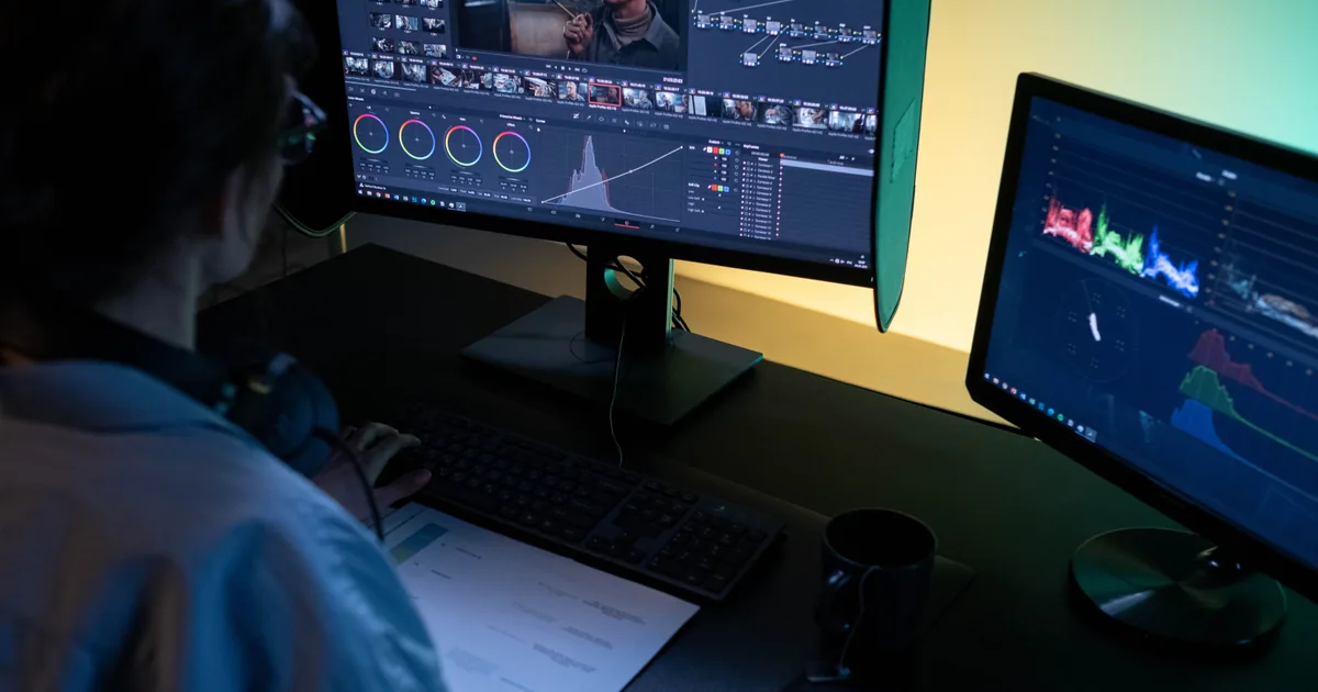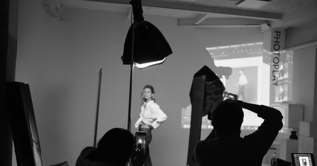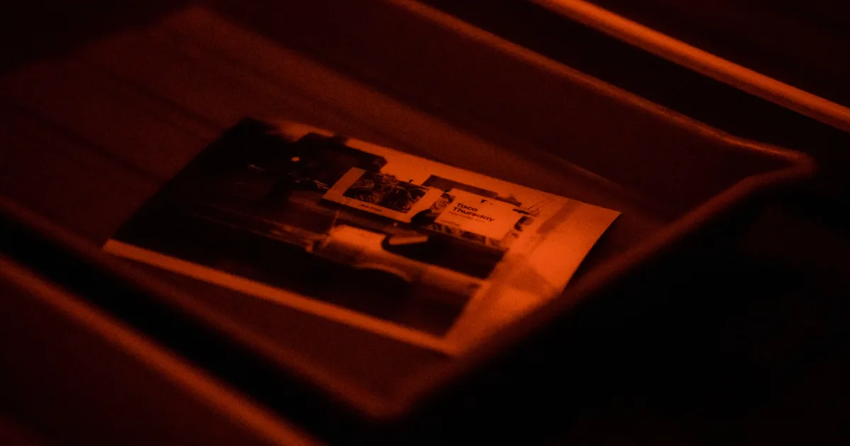
There are two kinds of photo printing service and they are not competing for the same job. Consumer labs are cheap, fast, and fine for a fridge magnet. Professional labs cost more, print on better paper, colour manage properly, and will send you a proof if you ask.
If you are selling prints to clients, the difference is the whole business. Here is how to choose one and how to stop the most common problem, which is prints arriving darker than they looked on your screen.
What a professional lab gives you that a consumer one does not
Colour management you can rely on. A professional lab publishes ICC profiles for its papers, so you can soft proof and see roughly what you will get. A consumer lab applies automatic corrections you cannot see or disable, which is why the same file comes back differently on two orders.
Paper choice that matters. Lustre, matte, metallic, fine art cotton rag, baryta. The paper changes the image more than most edits do, and a portrait on textured fine art paper is a different object from the same file on glossy.
Real black and white. Consumer machines produce colour casts in monochrome prints, usually green or magenta. A lab with a dedicated black and white process does not.
Mounting, framing, and albums as part of the same order, with consistent colour across the whole set.
Someone to email. When a print is wrong, a professional lab reprints it. A consumer service sends you a form.
Turn off auto-correction, always
This is the single most important setting when using any lab, and it is hidden in different places on every one of them.
Consumer labs apply automatic brightness, contrast, and colour corrections by default. If you have already edited the file, that correction is a second edit applied by a machine with no idea what you intended, and it is why a deliberately moody portrait comes back looking flat and bright.
Find the option, usually called auto-correct, auto-enhance, or colour correction, and disable it before ordering.
Why prints come back too dark, and the actual fix
The most common complaint in printing, and it is almost never the lab.
Screens emit light and paper reflects it. A monitor at 250 or 300 nits shows you an image far brighter than a print in a normally lit room can ever be. You edit until it looks right on a bright screen, and the print, with no backlight, arrives dark.
Two fixes, in order:
- Calibrate your monitor, and set the brightness to around 100 to 120 cd/m² for print work. That is much dimmer than most people run their screens, and it will look wrong for about a week.
- Soft proof in your editor using the lab's ICC profile for the specific paper, and check the out-of-gamut warning. Saturated blues and deep reds are the usual casualties.
If you do not want to calibrate, the crude workaround is to brighten shadows by about a third of a stop before sending to print, and to order a test.
It is the same underlying issue as photos looking washed out on the web: your screen is not neutral, and everything downstream inherits the difference.
How to test a lab before you trust it
Do this once, properly, before offering prints to clients.
Build a test file containing: a portrait with skin tones you know well, a high-key image, a low-key image, a saturated colour, a neutral grey patch, and a black and white conversion. Order it from three labs, on the papers you intend to sell, at the same size.
Compare them in daylight, side by side, against your screen. You are looking for skin tone accuracy first, then whether the blacks are actually black or dark grey, then sharpness and paper feel.
Keep the winner's prints as a reference set. When a print looks wrong later, you will have something to compare against.
Choosing paper for what you sell
- Lustre is the safe default for portraits: slight texture, resists fingerprints, holds contrast.
- Matte for a soft, editorial look, and for anything going behind glass in a bright room, since it kills reflections.
- Metallic for high-contrast, saturated images. Divisive, and spectacular on the right photograph.
- Fine art cotton rag for wall art you are charging properly for. It is the paper that makes a print feel like an object rather than a photograph.
Sell two options, not eight. Clients presented with a full paper list choose nothing, which is the same choice-paralysis problem that kills print sales in the gallery.
Prints as part of the business
Two practical points if you are selling rather than printing for yourself.
Order a sample of everything you sell. You cannot sell a 40 inch canvas you have never seen, and clients ask what it looks like in a room.
If you would rather not run a print store yourself, Xposure print sales let clients order prints, canvas and albums from their gallery. A professional lab makes and ships each order once you have checked it, and the lab cost comes out of the sale rather than your pocket.
And check the economics honestly: lab cost, shipping, your time, packaging, and any platform commission on the sale. Percentage-based commission on print sales is one of the least visible costs in this business, which is worth calculating rather than estimating and worth understanding before you pick where the store lives. It is also one of the things to check when choosing a gallery platform you can put your name on, since the storefront your client orders from is the one they associate with you.
For clients who would rather print themselves, give them the files and one sentence of guidance: use a proper photo lab rather than a supermarket kiosk, and do not let it apply automatic corrections. It costs you a print sale occasionally and it saves you the conversation about why their photos came back orange.